Campbell Street Senior Living had built a strong reputation across their communities, but their digital presence told a different story: a fragmented collection of outdated, disconnected websites that made it harder to attract both residents and caregivers. We rebuilt the entire thing from the ground up, consolidating every community into one scalable platform that finally reflects the quality of care they deliver.
How We Unified Campbell Street Senior Living's Digital Presence and Turned Their Website Into a Hiring Engine
Client Overview
Campbell Street Senior Living operates a portfolio of senior living communities, each with its own personality, leadership, residents, and local reputation. They're in an industry where trust is everything. Families researching care for a parent, and caregivers choosing where to build their careers, are both making deeply personal decisions. Their digital presence needed to reflect the quality of care they provide. It wasn't.
The Challenge
When Campbell Street came to us, their web presence had grown the way most multi-location businesses grow online: organically, reactively, and without a master plan. Every community had spun up its own separate website over the years. On paper that sounded like local autonomy. In practice, it created a sprawling problem.
A fragmented brand. Each community site looked and felt different. A family exploring two or three Campbell Street locations would encounter inconsistent navigation, mismatched typography, conflicting tones of voice, and varying levels of polish. There was no unified Campbell Street story, just a loose federation of pages that happened to share a parent company.
An operational nightmare. Managing content across that many independent sites was punishing. Every event, job posting, testimonial, or community update meant logging into a different system, fighting with a different template, and hoping nothing broke. Predictably, things did break. We found pages with outdated information, dead links, missing photos, and content that hadn't been touched in years. The team didn't have a content problem so much as they had an architecture problem. The system made keeping things current nearly impossible.
An outdated design. The flagship site looked like it belonged to a different era of the web. For an industry where prospective residents and their adult children are making high-trust, high-stakes decisions, a dated website is a quiet liability. It tells visitors before they ever read a word that the organization may be behind the times in other ways too.
No clear hiring story. Senior living is a people business. The quality of every community comes down to the people on the floor every day. But the existing site barely talked about who Campbell Street is as an employer, what they value, or why a caregiver should choose them over the dozen other senior living operators hiring in the same markets. In a tight labor market, that's a major missed opportunity.
The Solution
We approached this as a full rebuild rather than a refresh. The goal wasn't to make the old sites prettier it was to consolidate, modernize, and turn the website into an operational tool that actually works for Campbell Street's team.
One Unified Site, Built to Scale
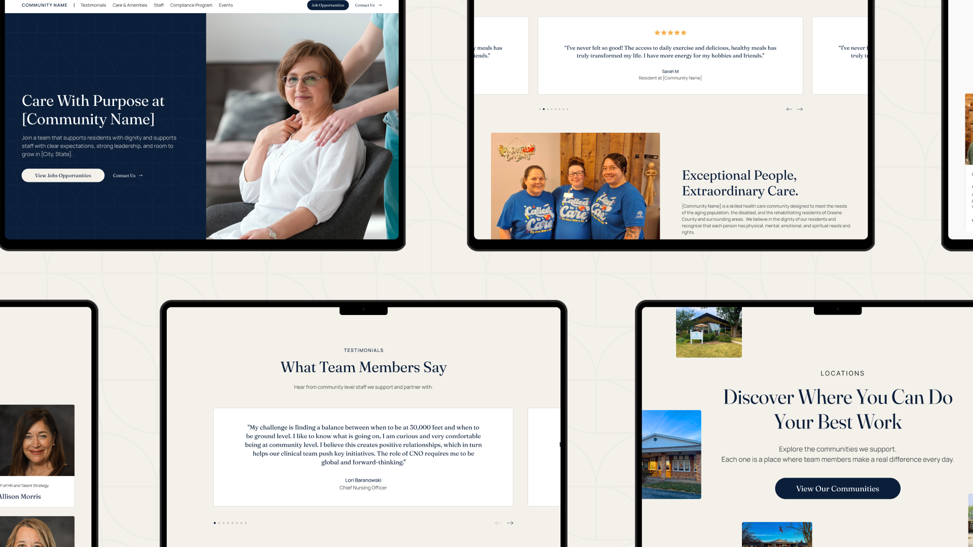
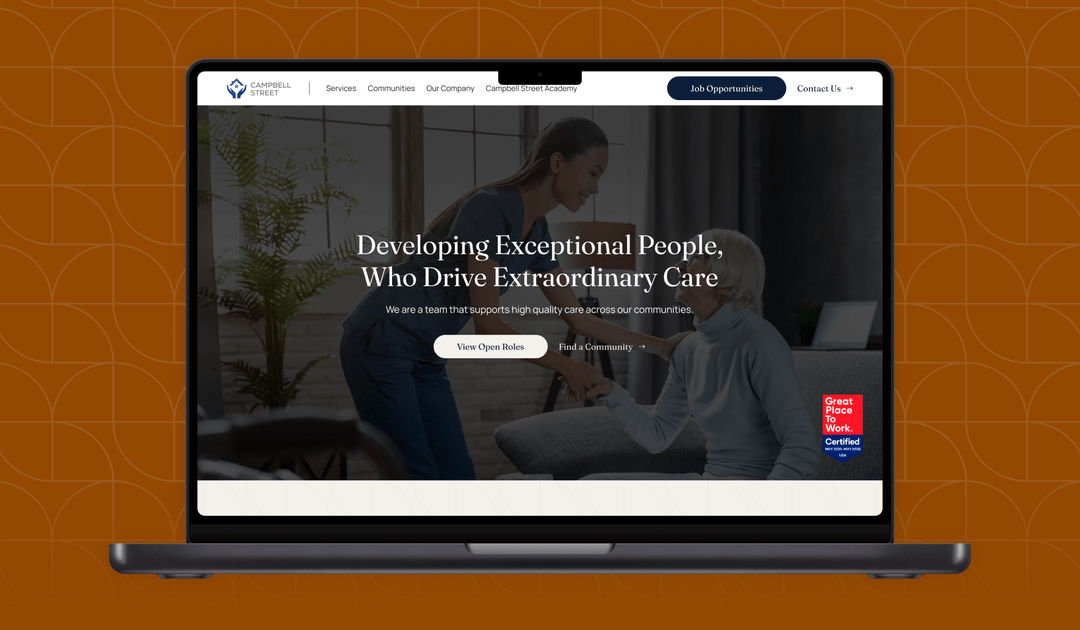
We replaced the entire patchwork of separate community websites with a single, cohesive platform. Every community now lives under one roof, with a consistent design system, consistent navigation, and a consistent voice while still giving each location the space to showcase what makes it distinct. Families researching multiple communities now have a coherent experience instead of jumping between disconnected sites.
The new visual design is warm, modern, and human. It matches the actual experience of walking into a Campbell Street community: professional, welcoming, and clearly built around people. We were deliberate about avoiding the sterile, corporate look that plagues so much of the senior living category, and equally deliberate about avoiding the cliché stock-photo aesthetic that makes most senior living sites feel interchangeable.
A CMS Built for the Way They Actually Work
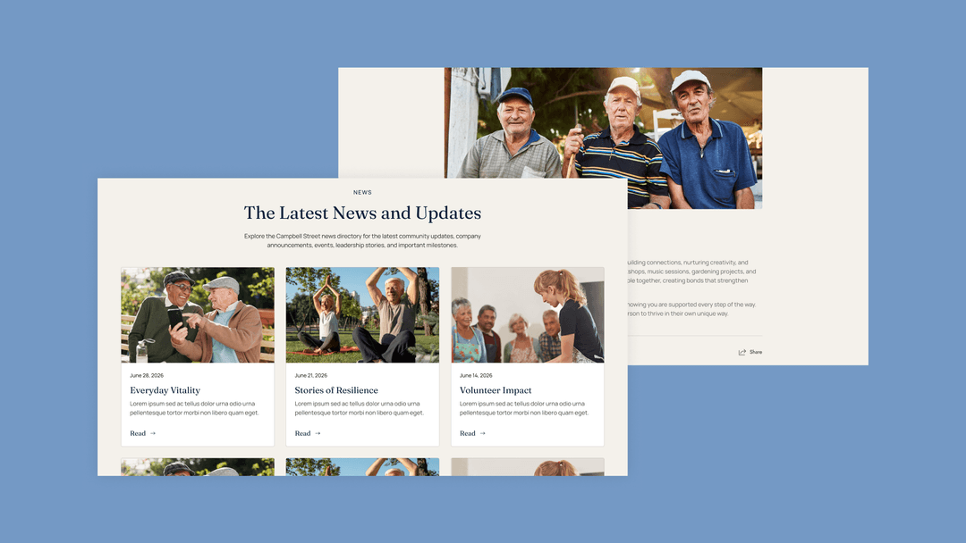
The single biggest operational win is that almost everything meaningful on the site is now dynamic and managed through purpose-built CMS collections. Campbell Street's team can update the site themselves, from anywhere, without ever touching a developer. That includes:
Testimonials — surfaced contextually across the site wherever they add credibility
Events — managed in one place, displayed automatically on the relevant community pages
Job opportunities — published once, syndicated everywhere they need to appear
News and blog posts — a real publishing workflow instead of a forgotten "news" tab
Employee highlights — putting actual team members front and center
Community information — each community's details, photos, amenities, and contact info, all managed centrally
The structural payoff is significant: when Campbell Street adds a new community in the future, it slots into the existing system instead of requiring a new website. When they want to feature an employee, run a hiring campaign, or promote an event, it's a five-minute task rather than a five-day project.
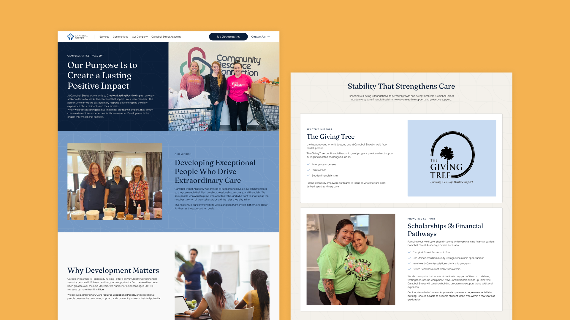
A Content Rewrite Focused on Hiring and Values
We didn't just redesign the site, we rewrote it. And we made a deliberate strategic shift: instead of leading with services and amenities like most senior living sites do, we leaned into Campbell Street's values and what it's like to work there.
This reframes the website as a hiring asset in addition to a marketing one. Caregivers researching potential employers now land on a site that clearly communicates who Campbell Street is, what they stand for, and why someone who cares about doing this work well should want to be part of it. In an industry where staffing is the single biggest operational challenge, that's a meaningful competitive advantage.
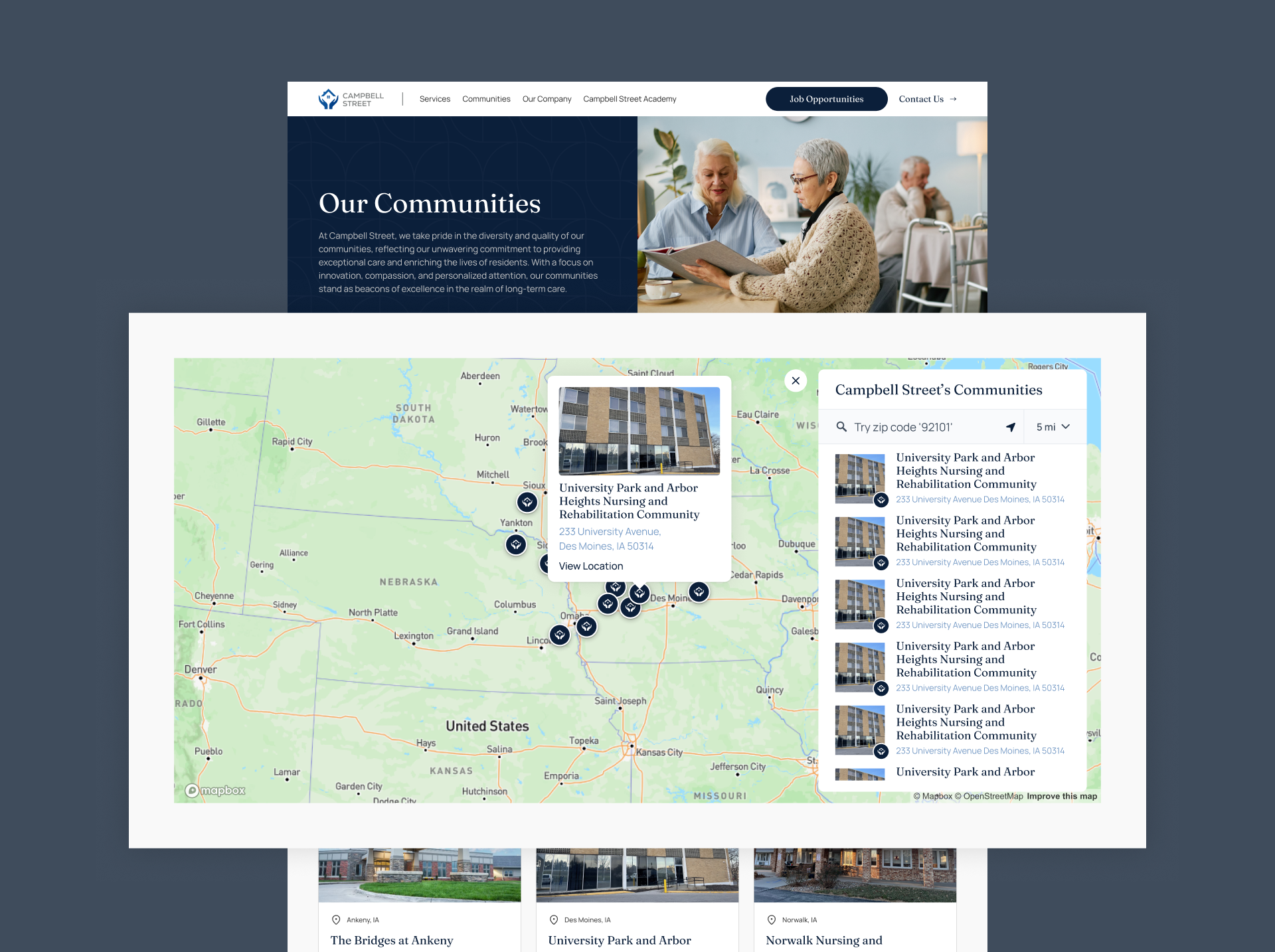
An Interactive Community Finder
With as many communities as Campbell Street operates, "find the right one" needed to be effortless. We built a searchable, filterable map that lets families narrow communities by location and the criteria that matter most to them replacing what would otherwise be an awkward list or directory. It's the kind of feature that simply wasn't feasible under the old fragmented architecture and is now a natural part of how the site works.
The Results
The new Campbell Street site delivers on every dimension of the original brief:
One platform replacing many. Campbell Street's team manages everything from a single, sane backend instead of juggling a dozen disconnected sites.
Content that stays current. With dynamic CMS collections powering events, jobs, testimonials, news, and community info, the site no longer drifts toward stale within months of launch.
A brand that matches the care. The new design finally reflects the quality of the in-person experience, building trust with prospective residents and families from the first impression.
A hiring asset, not just a brochure. By leading with values and people, the site now does real work in attracting the caregivers Campbell Street wants to hire.
A scalable foundation. As Campbell Street grows, the platform grows with them. New communities, new content types, and new initiatives all plug into the existing system.
Why This Matters
Multi-location operators in any service industry like senior living, healthcare, fitness, hospitality, or education tend to accumulate this exact kind of digital debt. Separate sites pile up. Content goes stale. The brand fragments. Marketing slows down. Hiring suffers. The fix isn't a redesign. It's an architectural rebuild that aligns the website with how the business actually operates.
That's the work we did for Campbell Street, and it's the kind of work we love doing.
A full website rebuild and ongoing marketing partnership for a resort-style senior living community near Orlando, offering Independent Living, Assisted Living, and Memory Care in one of Florida's most sought-after locations.
A full-scale visual identity and master brand system for a 100-acre mixed-use, multi-generational development in Scott County, Virginia, including a flexible sub-brand architecture for the community's many distinct components.